Lidar News Magazine
Client: Spatial Media LLC
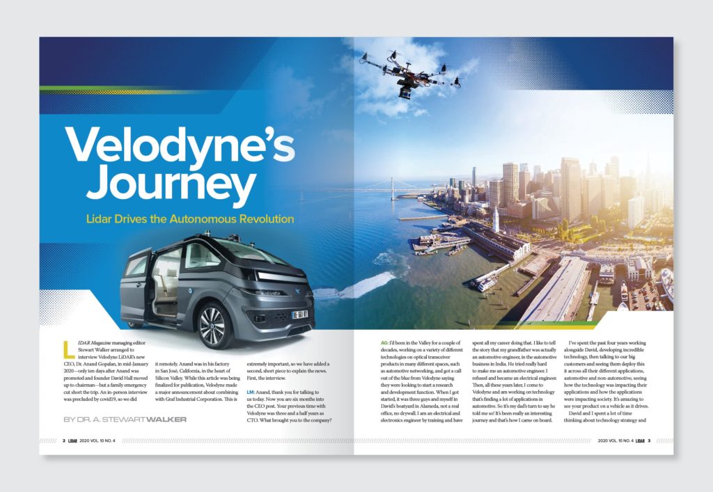
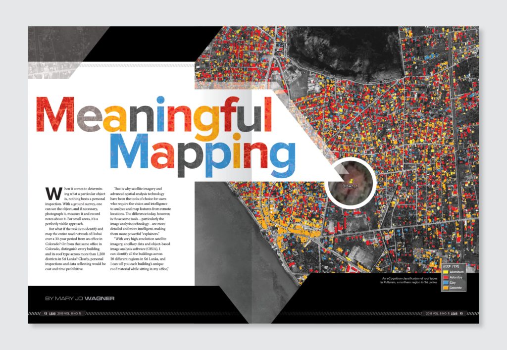
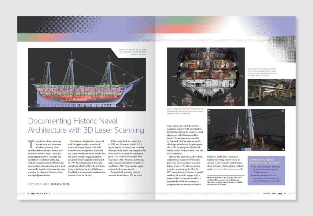
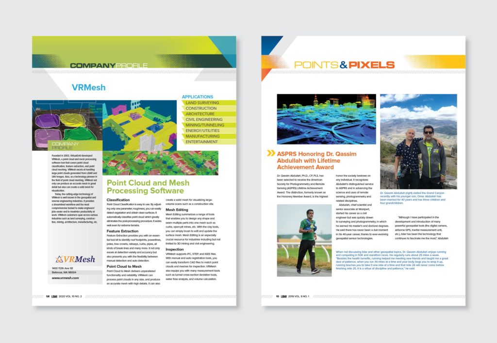
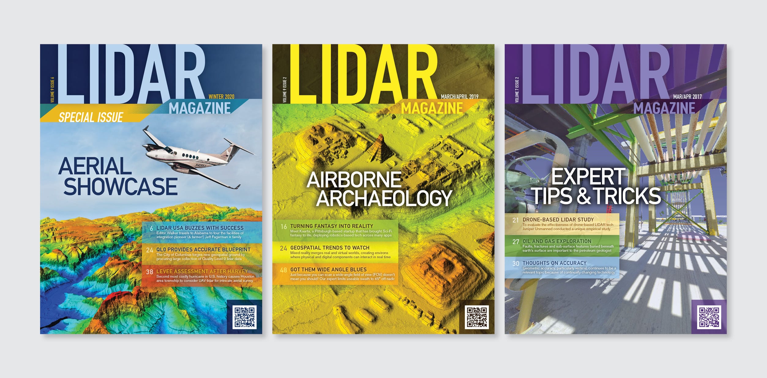
Challenge: Lidar magazine was a start-up publication in a burgeoning industry. As such, they needed a versatile magazine template that could be completed on a limited monthly budget. Articles written by engineers often yield verbose headlines that hinder attempts at artistic typography. The magazine also faced the necessity of incorporating uninteresting, low-resolution images. We identified the need for template elements with enough design weight to balance these drawbacks while being flexible enough to complement large, colorful, high-quality imagery when available. We decided that the best way forward would be to use a ‘glorified template’ for feature stories rather than a completely custom design tailored to each story.
Solution: The LIDAR process involves 3D scanning of the physical world to collect many data points and build digital models. We developed a design structure based on a “dots” theme to tie the template in with the subject. Subtle gray dotted bars at the top and bottom of all pages and above and below pull quotes anchor pages that might otherwise have limited content. Building on this, we added an angled block that can be scaled up or down, made any color, and be positioned anywhere on the page. While the block is versatile, the angle is consistent throughout the entire publication. The third element combines the dots and the angled block to create a halftone gradient effect, used in versions with small or large dots.
LIDAR scan images contain vibrant, neon colors, so we unified all elements by applying these colors to the angled and gradient blocks. A plethora of combinations stem from rearranging the blocks, adjusting transparency effects when they overlap, and using an angled block to knock corners off images or carve out areas for captions. This guarantees an interesting design no matter how dull—or amazing—the story content is.
